CRFT
Personal Project
Brand Identity
CRFT is a new music venue with a bold, contemporary vision. Designed to host live music, DJs, exhibitions, and more, the space needed an identity that could be as adaptable as the venue itself.
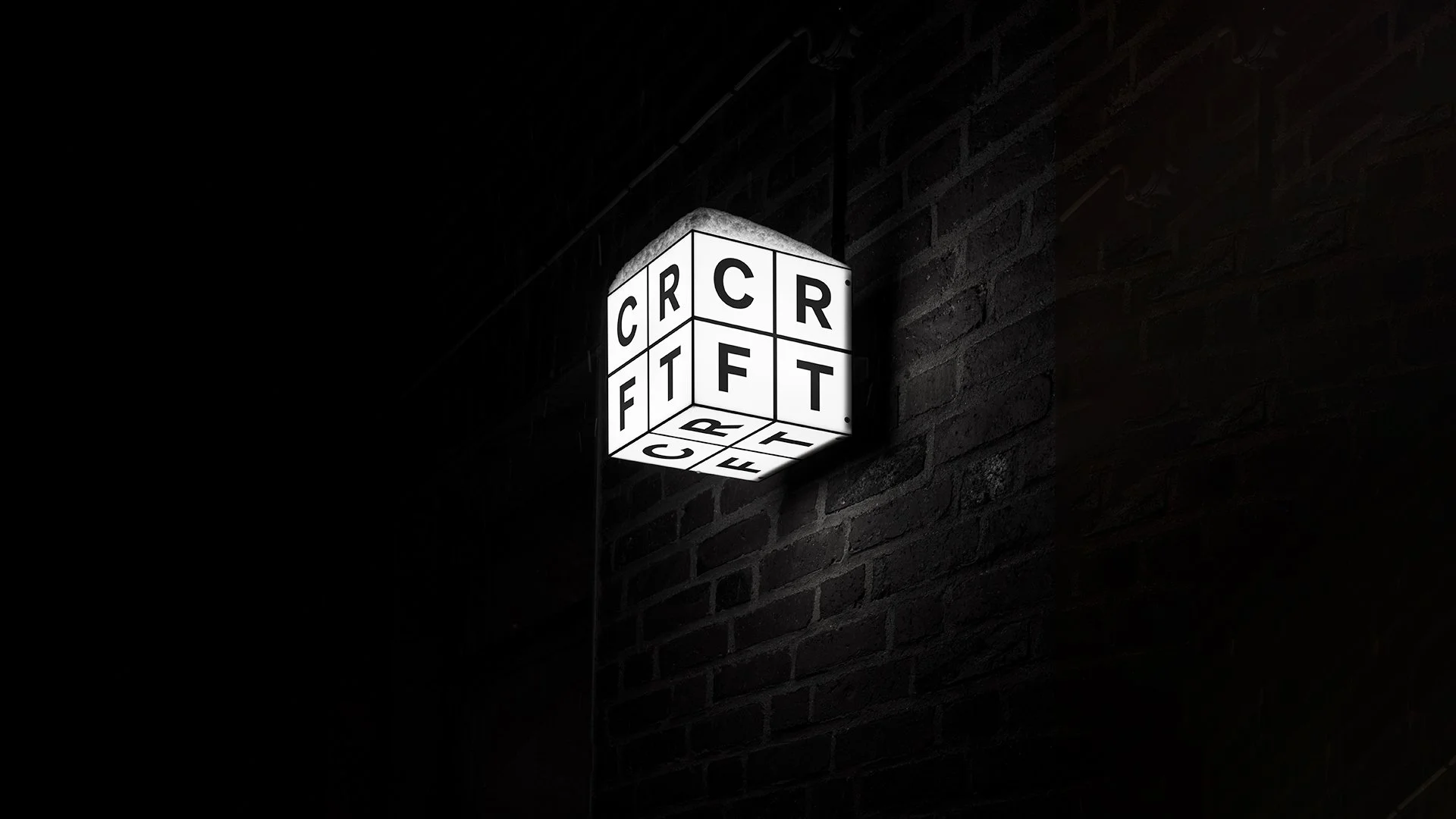
Local architects were commissioned to develop a modular interior system, allowing the space to be easily reconfigured for different uses and audiences. This idea of flexibility became a key influence on the identity, alongside the simplicity and precision of the architectural design.
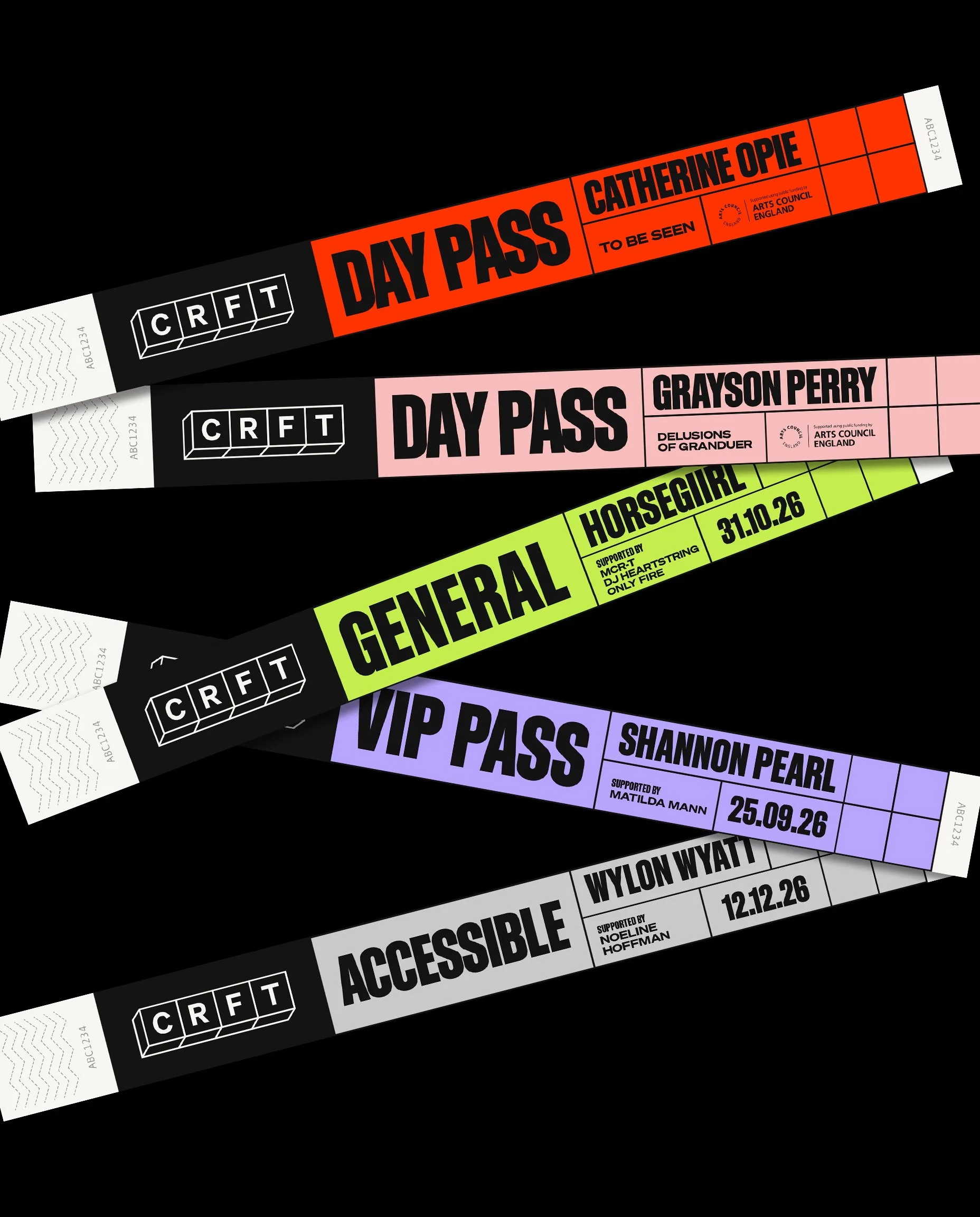
The colour palette is rooted in a strong contrast of off-black and warm white, supported by a flexible range of contemporary secondary colours. Designed to evolve alongside the diverse genres and events CRFT champions, the palette is intentionally expansive. Bold colour combinations are paired with striking black-and-white imagery, creating a distinctive visual language with a strong sense of consistency.
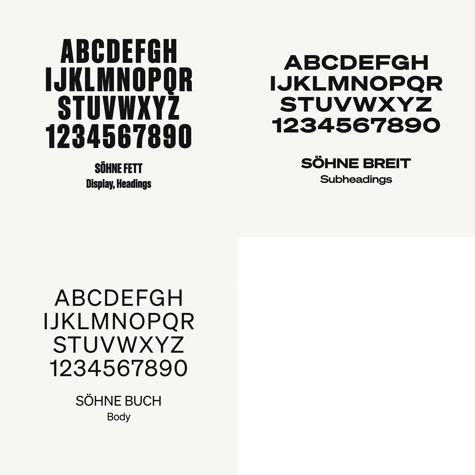
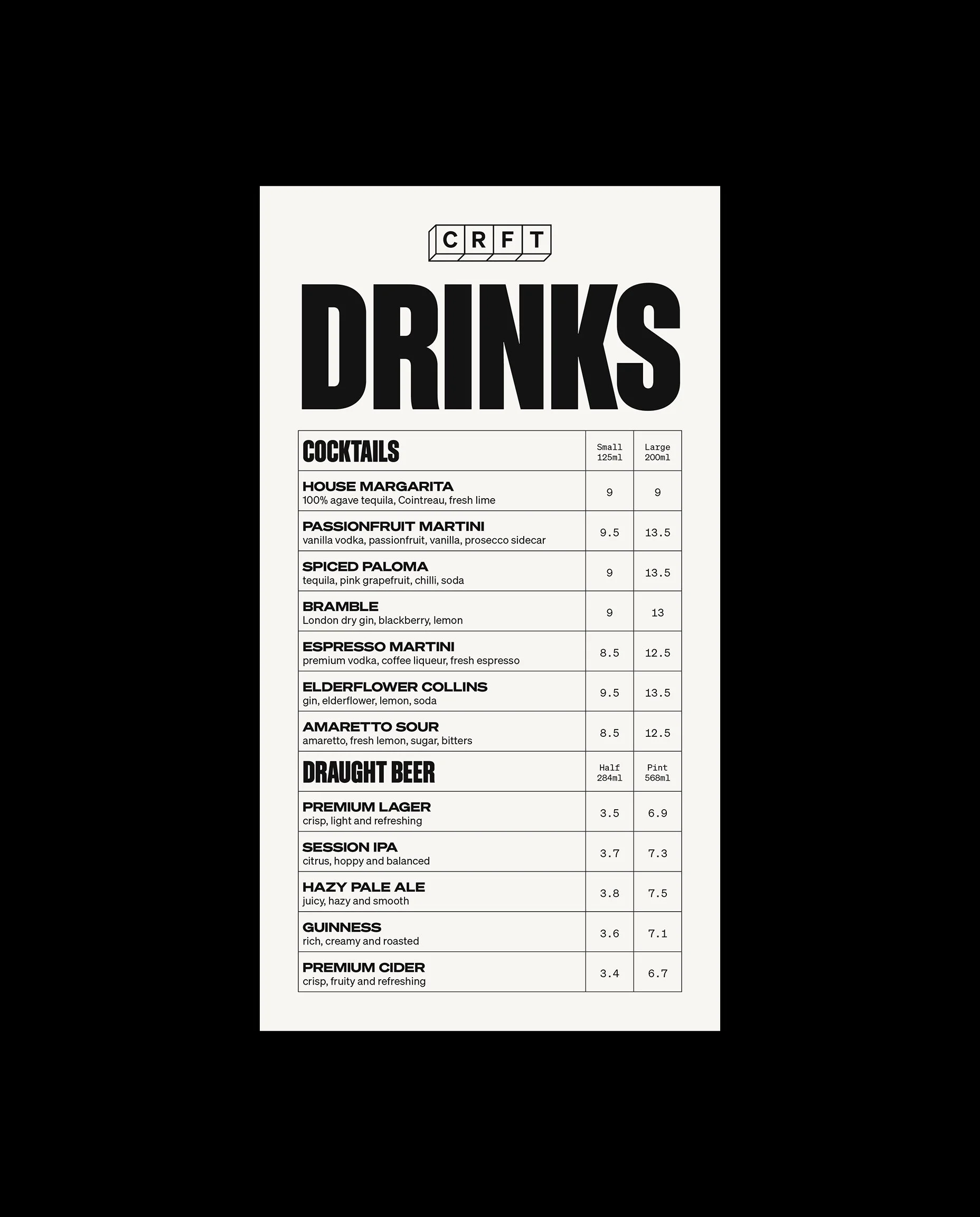
The Söhne typeface family brings a modern, bold typographic character to the identity. Used at large scale, typography becomes a key graphic element—adding personality, impact, and a sense of drama across the brand.
Reflecting the modularity of the venue itself, a series of flexible grids form the foundation of the visual system. Motion was also central to capturing the energy and adaptability of the space, with kinetic typography and modular movement extending the identity across digital, web, and social applications.
The result is a bold, graphic, and flexible identity designed to evolve with CRFT and the diverse creative programme it hosts.