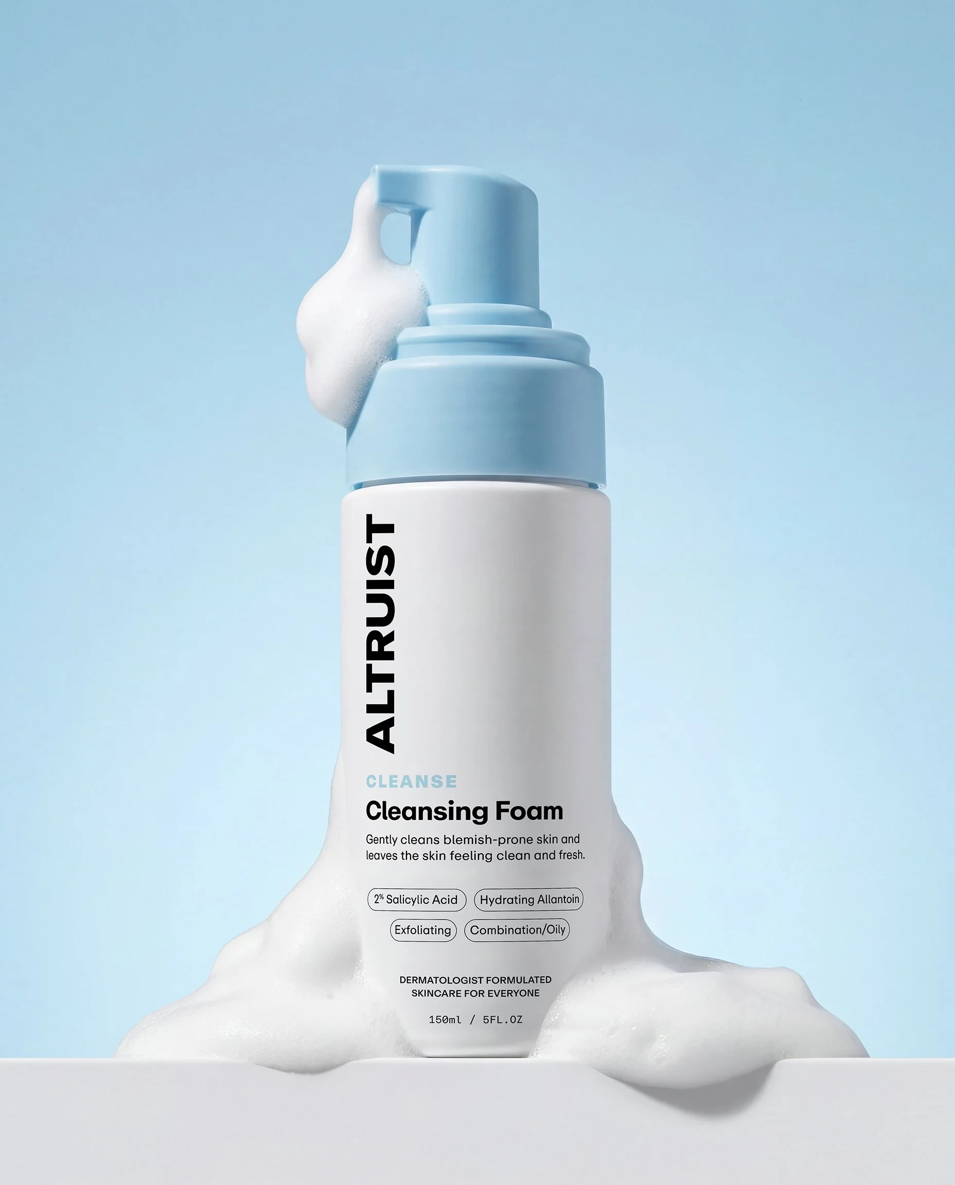
Altruist Skincare Rebrand
Personal Project
Brand Identity
Altruist Skincare is an affordable, dermatologist-developed brand specialising in high-protection sunscreens and skin barrier care. Founded by consultant dermatologist and skin cancer specialist Dr Andrew Birnie, the brand was built around a simple belief: dermatologist-formulated skincare should be accessible to everyone.
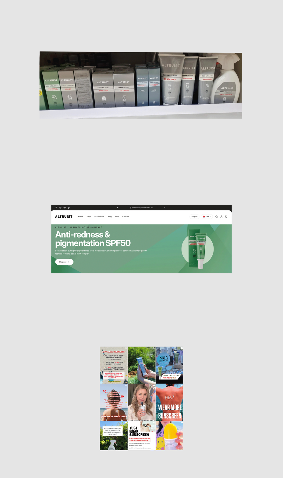
The existing identity didn’t fully reflect this proposition. The challenge was to evolve the brand into something more distinctive, contemporary and approachable, while retaining the trust and credibility of its dermatological expertise. The refresh needed to communicate Altruist’s altruistic mission and give the brand greater presence across an increasingly competitive skincare market.
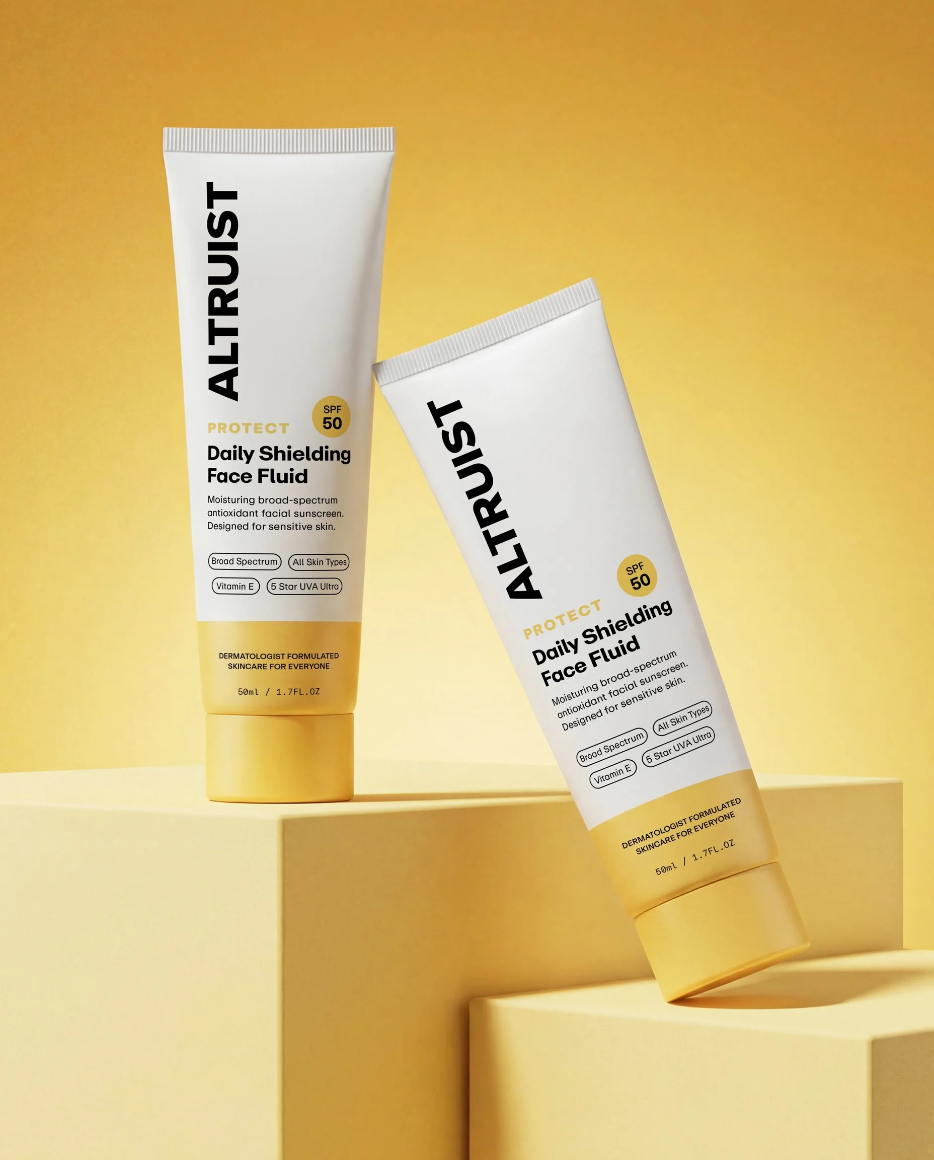
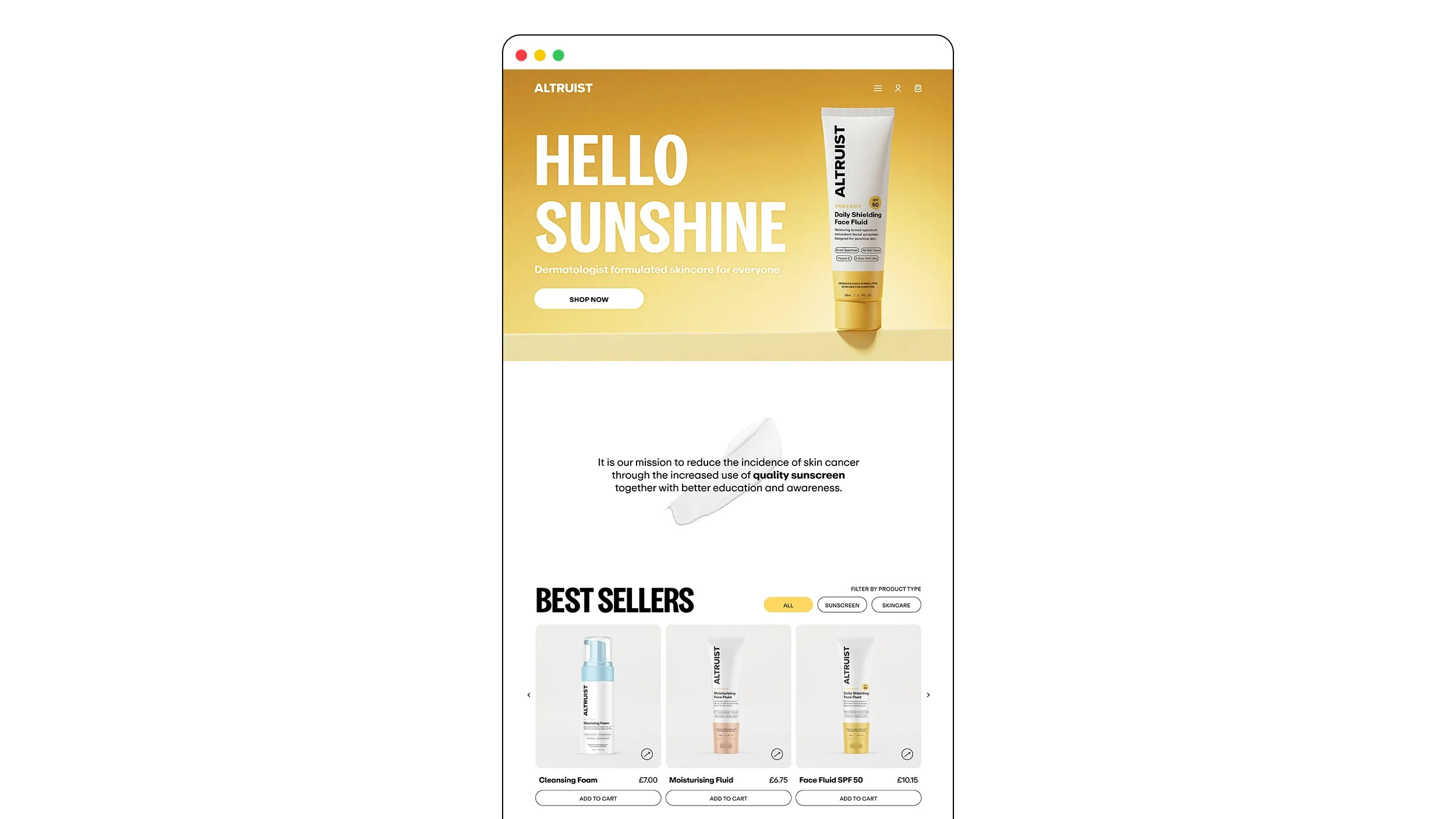
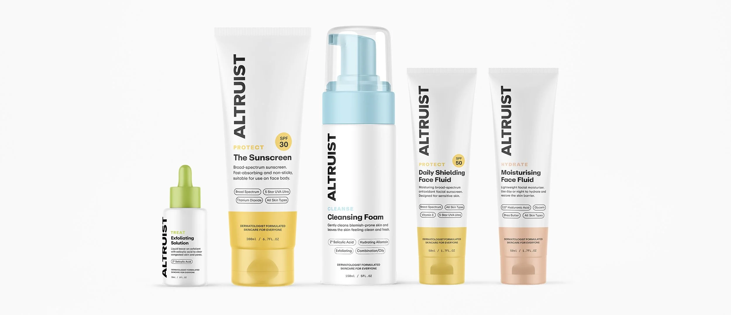
The new visual identity introduces a more optimistic and distinctive colour palette, grounded in white to retain the clean, clinical qualities associated with dermatologist-led skincare. A sunny yellow became the primary brand colour, bringing warmth, energy and personality, while supporting shades of light blue, green and peach create flexibility across the product range.
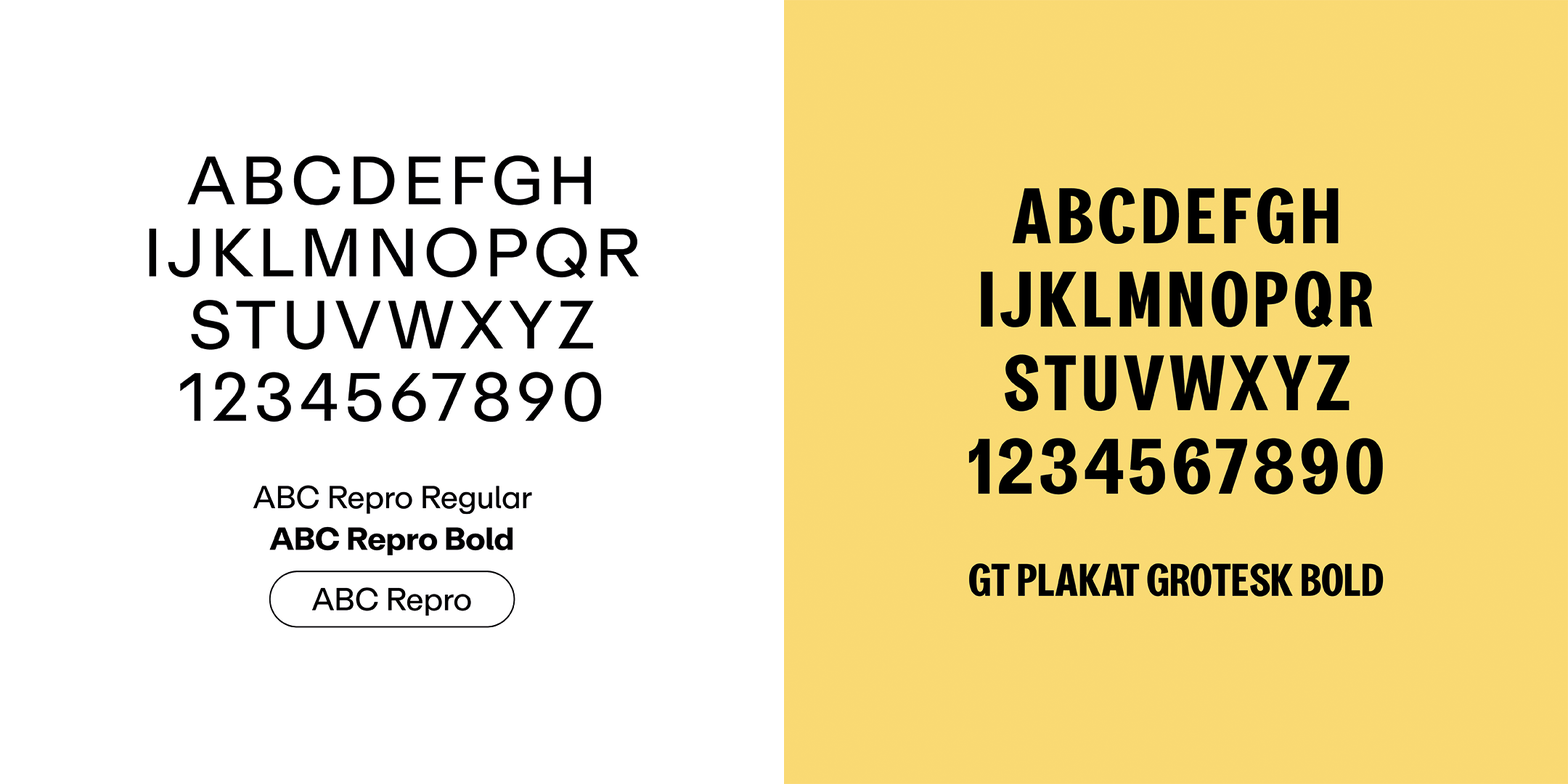
GT Plakat Grotesk Bold was introduced for headlines and display, bringing a distinctive and expressive character that softens the more clinical aspects of the brand. ABC Repro provides a clear, contemporary foundation as a primary typeface. The typography, together with a warmer tone of voice strike a balance between dermatological expertise and human warmth.
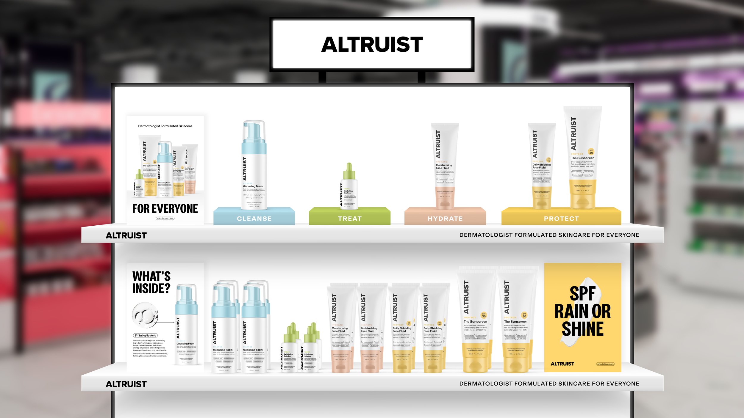
Packaging was a key focus, with the aim of strengthening both shelf presence and brand recognition. The Altruist logo was given greater prominence, creating a stronger and more recognisable brand block across the range. Colour differentiates individual products while maintaining a cohesive family, helping the range feel both distinctive and connected.
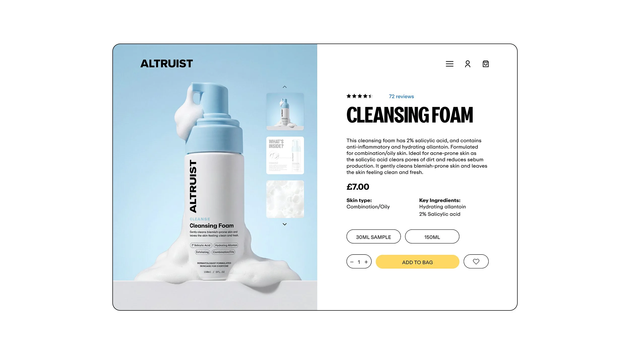
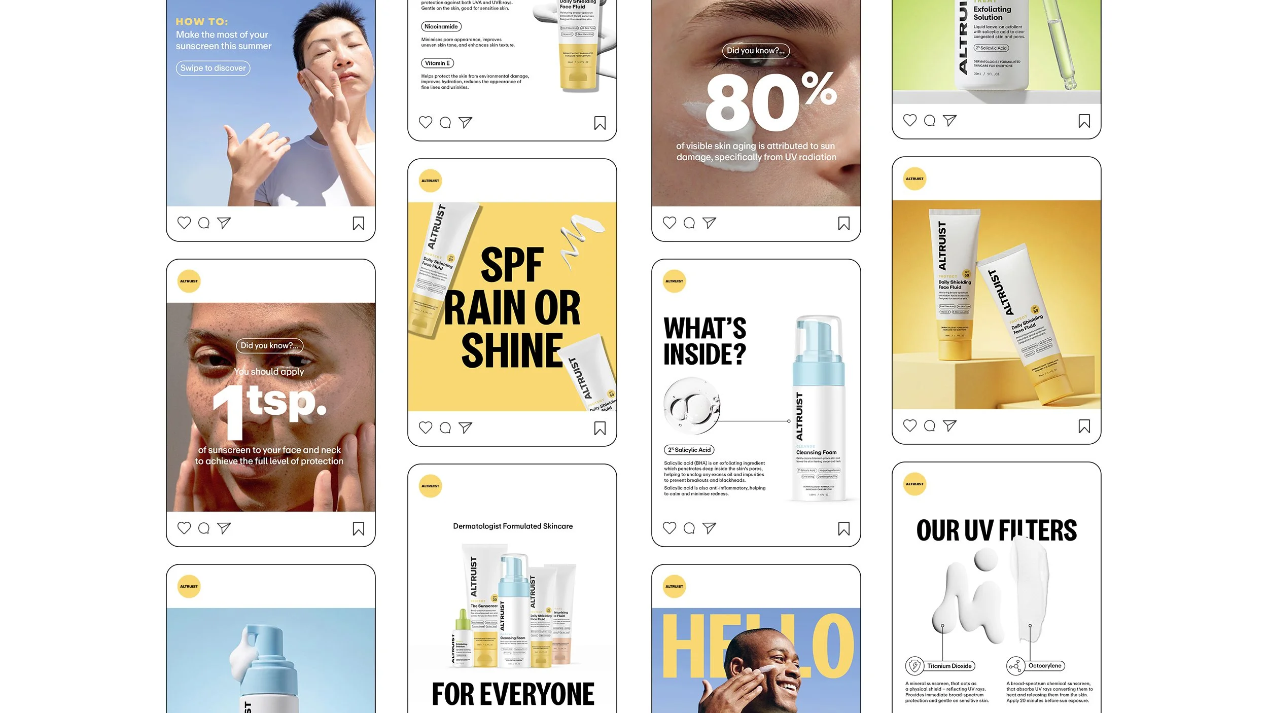
Roundels were introduced as a recurring graphic device to highlight key claims, ingredients and dermatological credentials. Beyond their functional role, they add rhythm and structure to the packaging and became a recognisable visual asset carried throughout the wider identity. The refreshed identity was extended across retail and POS, social and digital, creating a more cohesive and contemporary brand experience across every touchpoint.
The refreshed Altruist identity combines a clean clinical foundation with warmer colour, expressive typography and a more human tone of voice. The result is a brand that feels expert yet approachable, affordable yet aspirational, and credible without feeling overly clinical. Most importantly, the new identity better captures the spirit of Altruist — making high-quality, dermatologist-led skincare feel more accessible and inclusive, while giving the brand the confidence and distinctiveness to stand out within the category.