Drift Brewing Co.
Personal Project
Brand Identity
Packaging
Founded by the Martinez family in 1968, Drift is a brewing company with a tradition spanning three generations. For the launch of their first commercial brewery in LA’s Arts District, the brand needed to bridge generations — combining the city’s laid-back culture with a contemporary approach to craft beer.
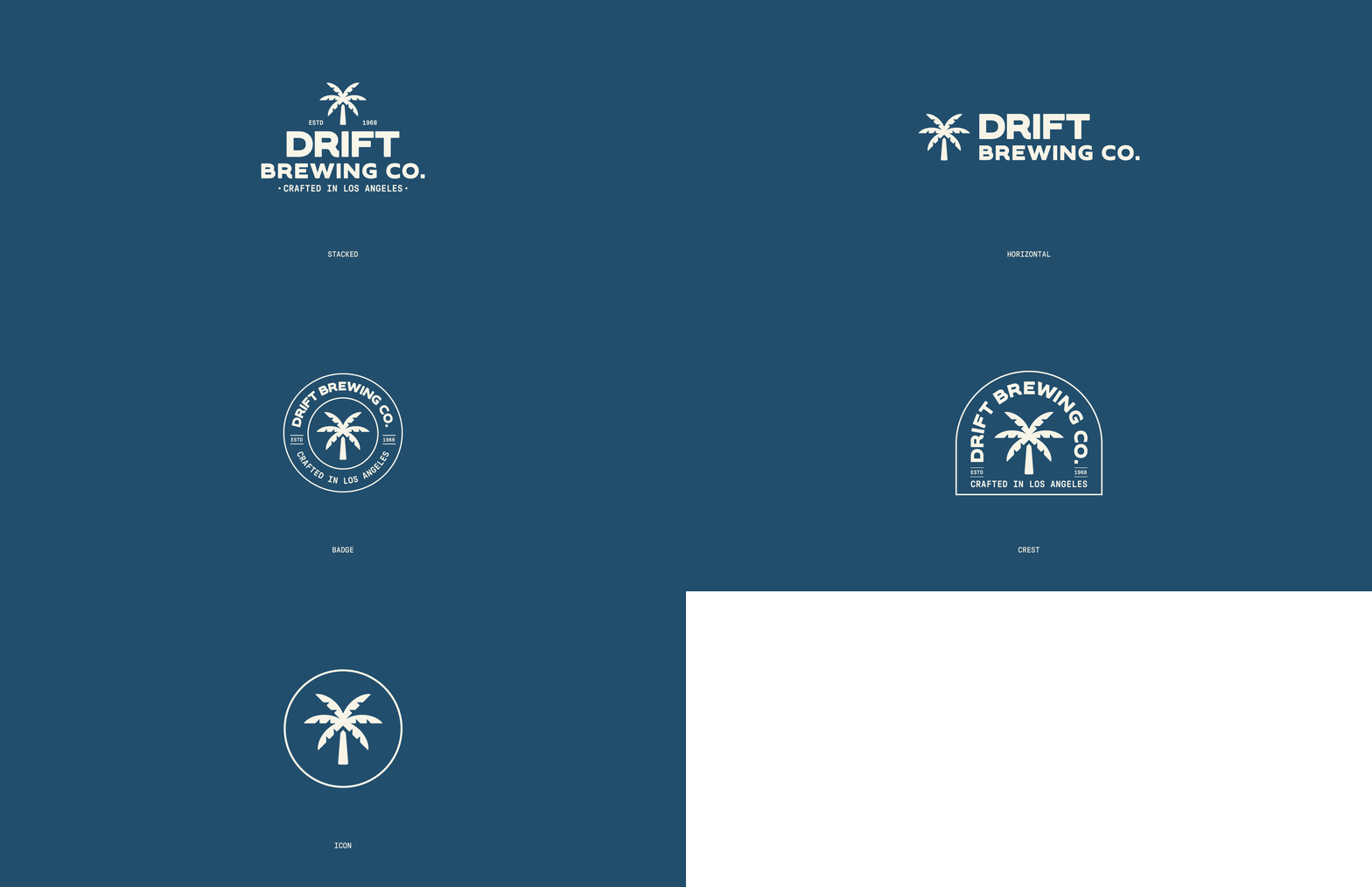
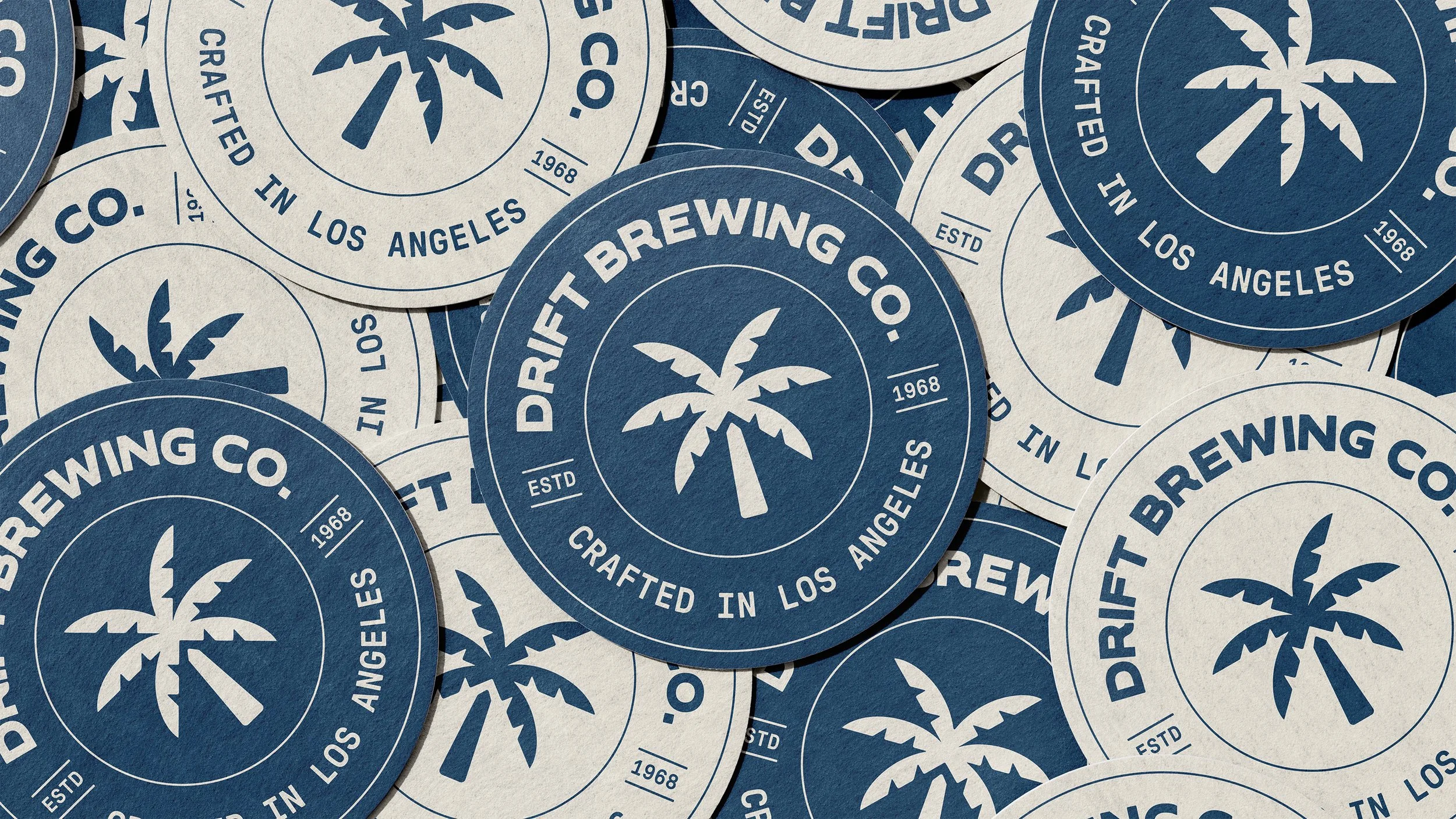
The identity was designed to feel distinctly LA while appealing to a design-conscious, modern craft beer enthusiast. At its heart is a flexible logo system featuring a custom palm tree icon, a familiar symbol of the city, reinterpreted with a simple, contemporary character.
A cool blue forms the foundation of the colour palette, supported by light blue, yellow and orange. Together, the colours create a flexible visual system that reflects the changing energy of LA, from day to evening.
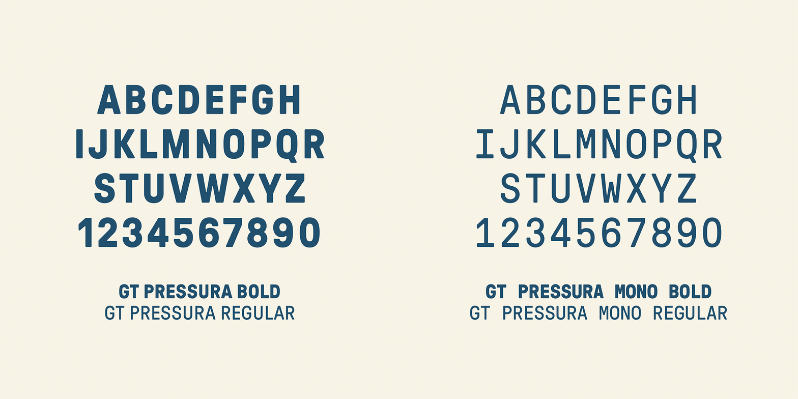
GT Pressura is used as the primary typeface, with GT Pressura Mono providing accents across packaging and callouts. Inspired by the history of metal printing, the typeface brings a tactile, industrial quality to the identity, reinforcing Drift’s emphasis on tradition, craftsmanship and quality.
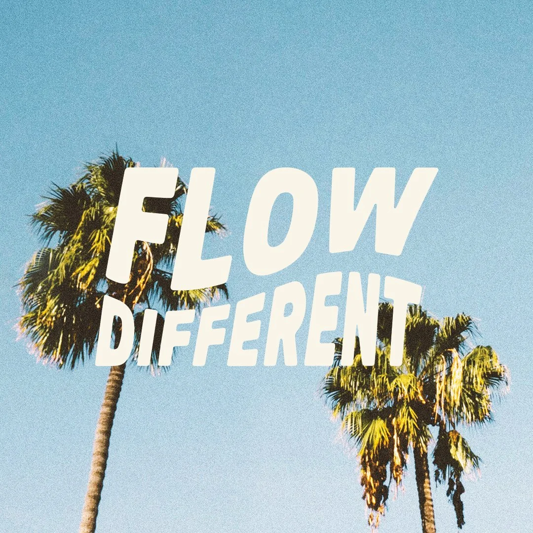
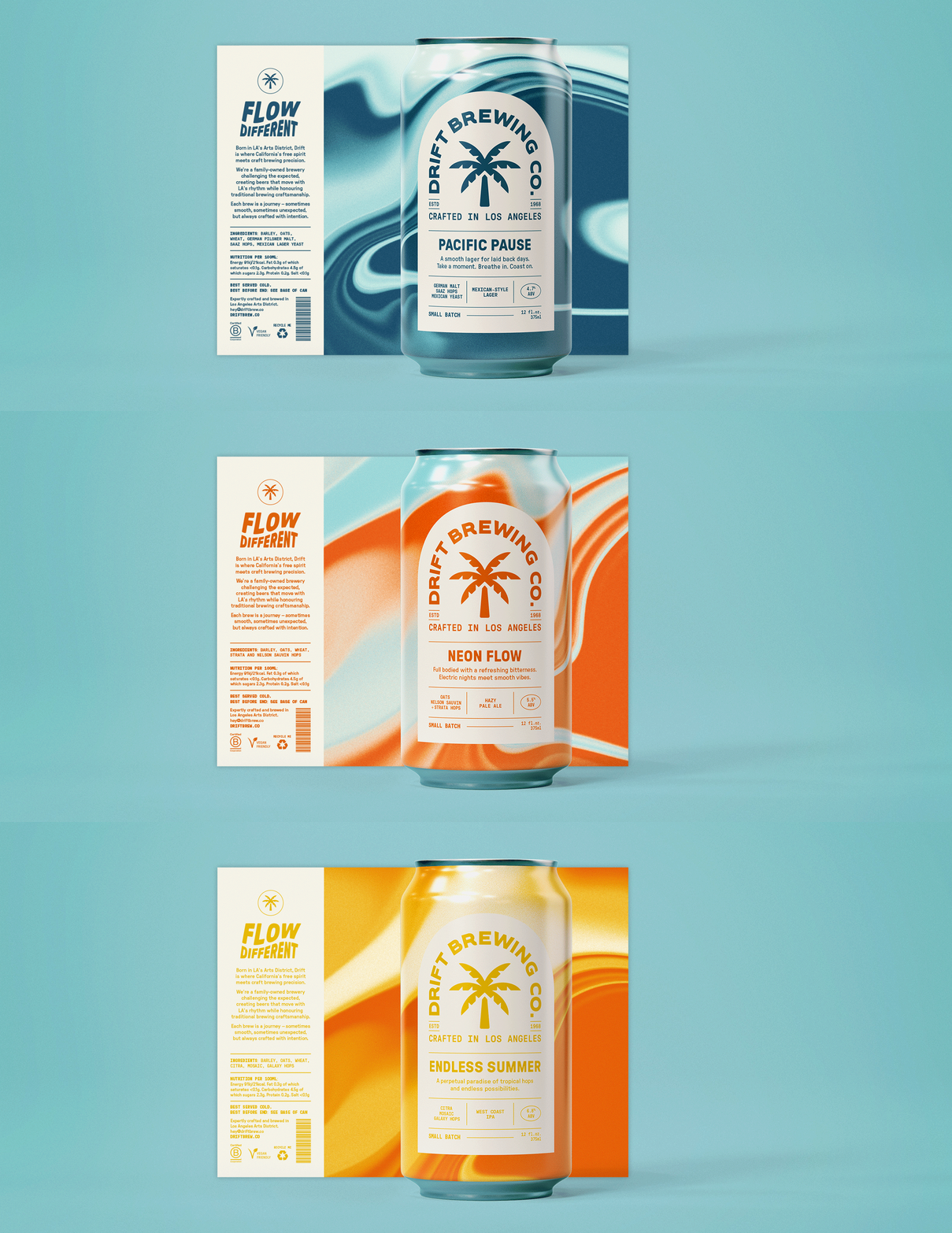
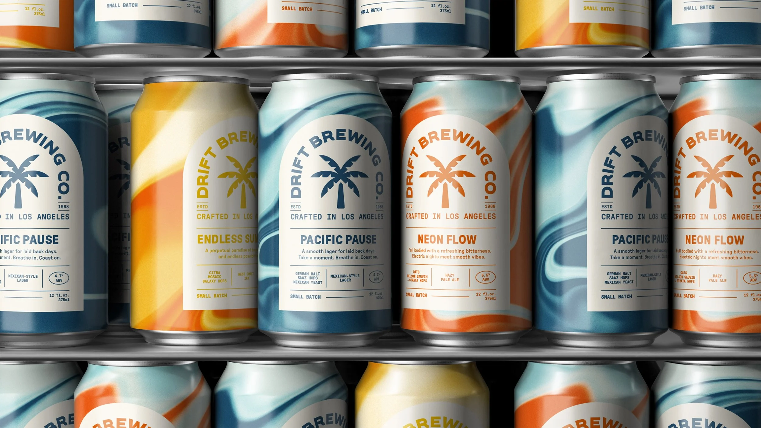
Packaging was a key focus, designed to stand out to a design-conscious consumer. The brand message “Flow Different” inspired a system of fluid gradients that reference the movement of beer and the blending of colours, while capturing the relaxed, sun-soaked feeling of a hazy day spent drinking with friends. The primary logo acts as a strong graphic device across the packaging, paired with a minimal label structure to create a considered, premium finish.
The resulting identity balances laid-back LA energy with a sense of heritage and craft creating a flexible brand that feels contemporary, distinctive and rooted in place.